Paul Lindström
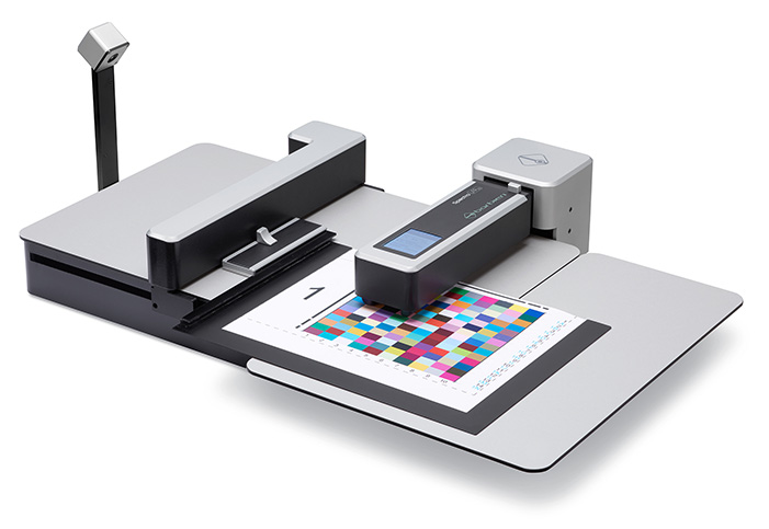
Er kan geen kwaliteitscontrole worden uitgevoerd zonder metingen. Het noodzakelijke instrument voor dergelijke metingen in de grafische industrie is – zoals bekend – een spectrofotometer. Er zijn veel modellen op de markt, en een handvol fabrikanten om uit te kiezen, dus in dit artikel gaan we in op de kenmerken waar u op moet letten bij het kiezen van de spectrofotometer, die het beste is voor uw toepassingen. (meer…)
Lees verder....
Interieurontwerp en -inrichting zijn perfecte kandidaten voor grootformaat digitaal printen, omdat de technologie zowel korte oplages tot afzonderlijke items als korte doorlooptijden van ontwerp naar proefdruk en uiteindelijke prints mogelijk maakt. Maar zoals bij elk type printproductie is toegepast kleurbeheer de sleutel voor een succesvol project. (meer…)
Lees verder....
In het kader van de Wild Format serie artikelen legt expert gastauteur Paul Lindström (in het Engels ) uit wat er vandaag de dag nodig is om de juiste kleuren op een groot formaat print te krijgen.
It’s now 25 years since the International Color Consortium (ICC) was formed and the ICC colour management technology introduced. The ICC started as a joint effort between Adobe, Agfa, Apple, Kodak and Microsoft. Their idea was that colour management should be done starting at the computer operating system level, and that all applications should do it in the same way. This would add both consistency and ease of use. The ICC invented a standard file format for colour conversions: profiles.
The ICC’s colour scientists also decided that colours should be defined neither in CMYK (Cyan, Magenta, Yellow and black, called K because it’s the Key colour) nor RGB (Red, Green, Blue) colour spaces, because doing so limits what can be done with the colour data. Instead the ICC technology is based on the CIE Lab and CIE XYZ colour spaces which are much larger. These colour spaces are collections of mathematical definitions of all the colours humans can perceive, which is way more than either CMYK or RGB can represent.
Why a device independent colour space?
As a designer you might wonder why this needs to be so complicated and technical: can’t we just use RGB or CMYK for simplicity? Well, we can’t, because the appearance of colours is so subjective. In both CMYK and RGB it depends on how the device rendering the colours behaves. Not all monitors show the same colour for a given value of RGB, not even white or black. The same goes for prints. The Cyan will look different, depending on the inks and paper used and on the printing method.
The ICC’s approach defines colours within a much larger colour space than the CMYK or RGB colour spaces, so that how they look is not influenced by the peculiarities of a particular imaging device. Inside ICC profiles colours are defined by a numeric value, based on where they are in the CIE Lab or CIE XYZ colour space.
Lighting up
In an ICC profile the reference lighting is normally expected to be standardised daylight. This is defined as D50, an artificial light with a certain spectral distribution at 5000 Kelvin, a measure of temperature. However you can convert the reference lighting to other types of light, such as D65 (6500K) as is used in Adobe RGB and sRGB.
Colour conversions
To make a colour conversion from for example RGB to a print specific combination of CMYK, you need to know or specify what type of RGB your image is referring to, as well as the correct ICC profile for your print production. Adobe RGB and sRGB are among the most popular for photos, but you need to know which one has been applied to your images in order to handle the conversions correctly.
What devices do I need to calibrate?
As a designer you must calibrate your monitor, if you want to see colour accurate artwork and images. For this you will need a colorimeter or spectrophotometer. If you buy a high end proofing monitor – which we recommend because you can’t really calibrate cheap standard monitors properly – the manufacturer will provide dedicated software for calibrating it. The monitor software will also support the most commonly used colorimeters and spectrophotometers. In the process of calibrating your monitor, you will create a unique ICC profile for it. This ICC profile will define the colour characteristics of your monitor as it is setup by you. Inside the ICC profile is a table mapping how the monitor’s RGB values correspond to values in CIE Lab, and how they will be used by the colour management system to display colours correctly.
 Colour accurate proofs
If you want to make colour accurate proofs on your colour printer, you will also need to buy a spectrophotometer and possibly some special software to calibrate the printing device. If you are serious about colour accurate print production, and do lots of hard copy proofing, it’s worth the effort to invest in a high end raster image processor (RIP) so that you have a completely colour accurate proofing system.
This can be a step too far for many designers as most prefer to do colour accurate soft proofing on screen, typically through Adobe CC and/or Adobe Acrobat. But remember, colour accurate softproofing isn’t possible unless your monitor is calibrated and stable over time. Investing in a good monitor and learning how to calibrate it correctly is an important and necessary step for your wild format projects.
How do I do softcopy proofing?
First make sure that you have established stable conditions for your monitor, avoiding strong light shining onto its surface and checking that it’s set to the brightness and whitepoint you want. This could be for example D50 at a brightness of 160 cd/m2 (Candela per square metre is a measure of luminance often used to measure the brightness of monitors). Once it’s set, Adobe CC and other ICC compatible software can use your unique monitor ICC profile for all colour conversions and display colours accurately. You won’t see your ICC profile mentioned in the colour settings in the Adobe software, but if you want to double check which ICC profile is active for the monitor, go into the Systems Preferences on a Mac or Settings in Windows to find out.
In order to preview or softproof your design colour accurately on your calibrated monitor, you need an additional ICC profile for the output method to be used in final production. This profile describes the output device’s colour characteristics and a colour savvy printing company can provide you with such profiles. You copy the profile(s) to the systems folder on your computer and you can now tell Adobe CC what the output CMYK colour space is, and ask for a colour accurate preview on your calibrated monitor. This is what is meant by softproofing. Artwork can still be in RGB because it’s only temporarily converted to CMYK for viewing on the monitor, showing you a colour accurate softproof of what your work will look like in print. If you want, you can make a final conversion to CMYK at this stage, but if you change your mind about what printing technology you want to use, this conversion isn’t valid. Keep back-up copies of the RGB file if you want the flexibility to chose different print methods.
Another way to do the colour conversion is to create PDF files and to do the colour conversion automatically when the PDFs are generated. The relevant ICC profile will be embedded inside the PDF ready for the printing company.
How do I do hardcopy proofing?
Just as you can use a calibrated monitor to simulate how your artwork will look printed in CMYK, you can use a calibrated colour printer for a hardcopy version. The printer has to have a colour gamut large enough to mimic the colours the final printing device and its inks will produce. As with your monitor, you can calibrate a colour printer using ICC technology to get a unique ICC profile. By telling the colour management system that you want the output to match a certain printing device (and not your monitor or your colour printer), you can create colour accurate hardcopy proofs yourself. You will use the same type of procedure and technology as if you ordered hardcopy proofs from your print service provider. Most hardcopy proofs today are produced on high quality inkjet printers, typically from Canon, Epson or HP. But the beauty of digital large format production is that the proofs can also be made in the very same digital printer which will be used for the final production. This is of course the ideal situation, because then the proof sample uses the exact same inks, substrate and printing technology, as the final print run.
Spot the difference
The ICC technology only provides good colour management for working in either RGB, CMYK or greyscale (black and white). While you can call for spot colours in your designs, they are not very well displayed or colour managed unless you use a special application such as the tools EFI provides as part of its Color Profiler Suite. There are developments underway to improve colour management for spot colours in the latest version of ICC’s technology, but either way you must learn to properly colour manage RGB and CMYK in your processes to get the best results.
By learning about and applying ICC technology you can preview colours in your artwork as they will appear in the final print. This will help you avoid colour errors and so reduce waste and disappointments. It will also save time, expense and stress, so build up your knowledge and experience to master it and give yourself a value added edge.
Paul Lindström
Lees verder....While a surprising number of prepress operators and designers still spend a huge amount of time and materials “trying to get the colours right”, this should really be a quite straight forward process today. By applying modern tools for colour management, you will be more efficient managing your colour printers, reducing wasted time and consumables, and achieve a predictable and pleasing result.
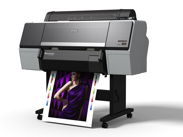
More and more colour printers can be equipped with a built-in spectrophotometer, like this Epson SC-P7000V. It makes both calibration and profiling much faster and efficient.
Learn how to use a spectrophotometer
There is no way around it – if you want to manage colours – be it on your screen or on your printer – you need to invest in a spectrophotometer. You will use this in the two main steps involved in colour management. The first step is a base calibration of the device. When you are assured that the device is in a stable and predictable state, you display or print a test form, and measure the colours the device now produces. The result is saved as an ICC-profile, and this will now tell the Colour Management System (CMS), inside the operating system in your computer, Mac or PC, how to manage the colours of your device. At the core of it, it’s no more complicated than that. But you will, of course, need some software in order to do this, and this is perhaps where the problem with colour management lies. There is a wide choice of software, and they often seem very complex and complicated to use. But be brave, and be a bit stubborn, and you will figure it out. There are many books written on the topic, but unfortunately not all of them are entirely accurate, and might confuse more than they help. One we can recommend though is Color Management Handbook: A Practical Guide by Adams, Sharma and Suffoletto – it’s a classic and goes through the basics as well as some of the more advanced stuff.
But let’s go through the two main steps – calibration and profiling – a bit more in detail, and it should help you get started with applied colour management.
Consistency and Calibration
There is actually a step before calibration that needs to be checked, to make sure you have a stable and repeatable result from your device. You need to ensure consistency. For a monitor screen, it means you need to ensure your environment has a stable and suitable light. Avoid strong light sources that can cause glare on the screen (don’t sit by a window with strong sun light.), and ideally you should have a shading hood on the monitor.
For a colour printer, you need to check that all the nozzles are clear and working and if you can check and optimize the registration of the nozzles, you should do this before calibration. Avoid fluctuations in temperature and humidity – they will both affect the printed result. To achieve the highest possible print print quality, you may need to use air conditioning to control both temperature and humidity. Now you can print a test form to check that the printer produces all the tone values in a linear way, meaning 50% cyan really comes out at 50% etc. If not – use the software to adjust this. For a monitor this calibration is done in the software, by measuring the tone values on the screen and adjusting if necessary so that the monitor produces a smooth reproduction of all the tone values.
Profiling (really called Characterisation)
When the printer is calibrated it’s time to print a colour chart representing all the colours in the expected colour gamut the printer can produce. In colour management language this is called characterisation, because when you measure this printed colour chart with a spectrophotometer the measurement data will describe the characteristics of the printer. The profile, because the ICC-profile is created based on this colour data, won’t correct any of the colours, contrary to what if often said about ICC-profiles. Instead, the colour table which resides inside the ICC-profile is used when converting colours from one colour space to another. Typically, this will be when you convert your images in RGB to the colour space of your printer, mostly the CMYK colour space. The CMS inside your computer calculates the closest match, using the table in the ICC-profile for your printer, to match the colour in your image. This is why it’s so important to use the correct ICC-profile when you prepare your design for output. If you are not sure it’s better to keep the images in RGB, and we would suggest Adobe RGB since it’s a quite large colour gamut, and let the printer convert to CMYK at the stage of output. But even better, is to ask the printing company which ICC-profile they suggest for the job in hand. This depends mainly on what substrate the job will be printed on and what ink will be used. The paper and ink are the two main factors which determine the achievable colour gamut.

Profiling, or as it really should be called, characterisation, means that you print and measure a colour target like this, and then create an ICC-profile based on this colour data.
The beauty of knowing the exact characteristics of a certain output device, that is, knowing which ICC-profile to use when printing on a specific substrate, is that you can now predict the end result. Using the Adobe Creative Cloud suite of software, you can preview with great colour accuracy what the colours and photos will look like, assuming you sit at a calibrated monitor of reasonable quality. Or you can use your calibrated colour printer as a proofer, simulating exactly what the final prints will look like.
More and more colour printers now have the option to have a spectrophotometer built into the printer – this will save you a lot of time, both when calibrating the device and when validating the printed result (checking that the printer conforms to the standard you want to achieve). All the professional RIP-systems have a Colour Management module – learn how to use this in depth. Or you can buy a stand-alone colour management solution to complement this – there are several very good ones on the market – ask the manufacturer of your printer which solution they know works well with your model.
Using applied colour management in this way will save you a lot of time, give you the satisfaction of knowing, not guessing, what the colours will look like when printed. This is quality control at its best, and will help you stay within budget or even save some money here and there.
Paul Lindström
The Wild Format guides are intended to expand awareness and understanding of the craziness that can be created on wide format digital printing devices, from floors to lampshades and everything in between.
These guides are made possible by a group of manufacturers working together with Digital Dots.
This article is supported by Efi (www.efi.com), Esko (www.esko.com) and HP (www.hp.com).
Together we hope you enjoy the articles and that you put into practise what you learn. If you want to talk about it, go to our LinkedIn group at via this link.
Enjoy and Go Wild!
Lees verder....
While a surprising number of prepress operators and designers still spend a huge amount of time and materials “trying to get the colours right”, this should really be a quite straight forward process today. By applying modern tools for colour management, you will be more efficient managing your colour printers, reducing wasted time and consumables, and achieve a predictable and pleasing result.
More and more colour printers can be equipped with a built-in spectrophotometer, like this Epson SC-P7000V. It makes both calibration and profiling much faster and efficient.
Learn how to use a spectrophotometer
There is no way around it – if you want to manage colours – be it on your screen or on your printer – you need to invest in a spectrophotometer. You will use this in the two main steps involved in colour management. The first step is a base calibration of the device. When you are assured that the device is in a stable and predictable state, you display or print a test form, and measure the colours the device now produces. The result is saved as an ICC-profile, and this will now tell the Colour Management System (CMS), inside the operating system in your computer, Mac or PC, how to manage the colours of your device. At the core of it, it’s no more complicated than that. But you will, of course, need some software in order to do this, and this is perhaps where the problem with colour management lies. There is a wide choice of software, and they often seem very complex and complicated to use. But be brave, and be a bit stubborn, and you will figure it out. There are many books written on the topic, but unfortunately not all of them are entirely accurate, and might confuse more than they help. One we can recommend though is Color Management Handbook: A Practical Guide by Adams, Sharma and Suffoletto – it’s a classic and goes through the basics as well as some of the more advanced stuff.
But let’s go through the two main steps – calibration and profiling – a bit more in detail, and it should help you get started with applied colour management.
Consistency and Calibration
There is actually a step before calibration that needs to be checked, to make sure you have a stable and repeatable result from your device. You need to ensure consistency. For a monitor screen, it means you need to ensure your environment has a stable and suitable light. Avoid strong light sources that can cause glare on the screen (don’t sit by a window with strong sun light.), and ideally you should have a shading hood on the monitor.
For a colour printer, you need to check that all the nozzles are clear and working and if you can check and optimize the registration of the nozzles, you should do this before calibration. Avoid fluctuations in temperature and humidity – they will both affect the printed result. To achieve the highest possible print print quality, you may need to use air conditioning to control both temperature and humidity. Now you can print a test form to check that the printer produces all the tone values in a linear way, meaning 50% cyan really comes out at 50% etc. If not – use the software to adjust this. For a monitor this calibration is done in the software, by measuring the tone values on the screen and adjusting if necessary so that the monitor produces a smooth reproduction of all the tone values.
Profiling (really called Characterisation)
When the printer is calibrated it’s time to print a colour chart representing all the colours in the expected colour gamut the printer can produce. In colour management language this is called characterisation, because when you measure this printed colour chart with a spectrophotometer the measurement data will describe the characteristics of the printer. The profile, because the ICC-profile is created based on this colour data, won’t correct any of the colours, contrary to what if often said about ICC-profiles. Instead, the colour table which resides inside the ICC-profile is used when converting colours from one colour space to another. Typically, this will be when you convert your images in RGB to the colour space of your printer, mostly the CMYK colour space. The CMS inside your computer calculates the closest match, using the table in the ICC-profile for your printer, to match the colour in your image. This is why it’s so important to use the correct ICC-profile when you prepare your design for output. If you are not sure it’s better to keep the images in RGB, and we would suggest Adobe RGB since it’s a quite large colour gamut, and let the printer convert to CMYK at the stage of output. But even better, is to ask the printing company which ICC-profile they suggest for the job in hand. This depends mainly on what substrate the job will be printed on and what ink will be used. The paper and ink are the two main factors which determine the achievable colour gamut.
Profiling, or as it really should be called, characterisation, means that you print and measure a colour target like this, and then create an ICC-profile based on this colour data.
The beauty of knowing the exact characteristics of a certain output device, that is, knowing which ICC-profile to use when printing on a specific substrate, is that you can now predict the end result. Using the Adobe Creative Cloud suite of software, you can preview with great colour accuracy what the colours and photos will look like, assuming you sit at a calibrated monitor of reasonable quality. Or you can use your calibrated colour printer as a proofer, simulating exactly what the final prints will look like.
More and more colour printers now have the option to have a spectrophotometer built into the printer – this will save you a lot of time, both when calibrating the device and when validating the printed result (checking that the printer conforms to the standard you want to achieve). All the professional RIP-systems have a Colour Management module – learn how to use this in depth. Or you can buy a stand-alone colour management solution to complement this – there are several very good ones on the market – ask the manufacturer of your printer which solution they know works well with your model.
Using applied colour management in this way will save you a lot of time, give you the satisfaction of knowing, not guessing, what the colours will look like when printed. This is quality control at its best, and will help you stay within budget or even save some money here and there.
Paul Lindström
The Wild Format guides are intended to expand awareness and understanding of the craziness that can be created on wide format digital printing devices, from floors to lampshades and everything in between.
These guides are made possible by a group of manufacturers working together with Digital Dots.
This article is supported by Efi (www.efi.com), Esko (www.esko.com) and HP (www.hp.com).
Together we hope you enjoy the articles and that you put into practise what you learn. If you want to talk about it, go to our LinkedIn group at via this link.
Enjoy and Go Wild!
Lees verder....
One of the main objectives for colour management is to get the most out of the printing device used to print the job. For a designer or project manager this can be a challenge because, in the early stages of design, it’s quite common that neither the printing press nor the substrate to be used are known. This means that the artwork must be created so that the colour separations and final colour adjustments can be made once the printing device, ink and substrate are known and at the very last minute.
This is important because it gives you the flexibility to make choices that suit your project. If you perform colour separations for images and other elements in the artwork very early on, you may be using an ICC profile that has a limited colour gamut and you can’t easily change your mind later. Once the colours have been converted to one flavour of CMYK, the maximum gamut is limited to that range of CMYK colours. Even if it’s technically possible to convert from one CMYK gamut to another, the number of tone values and the gradation of the images has been compressed in the first conversion, and this can never be fully reconstructed.
We suggest keeping your photos in a large gamut, typically RGB, at the design stage. Adobe RGB is a well-defined colour space and slightly larger than what most printing devices can reproduce, so it is very suitable. Use this as the default colour gamut for photos. There is another popular RGB colour space, sRGB, but this is much smaller than Adobe RGB, and smaller than the gamut of what many high-end printing devices can reproduce. So, while popular in consumer applications, we wouldn’t recommend using sRGB in high-quality print workflows, especially for wide format digital printing where colour gamuts can be very high.
Linework and other design elements, especially brand colours and logos, can be addressed as special colours, called spot colours, in the design stage even if they may end up being printed as CMYK only. The principle here is to only convert spot colours to CMYK when, and if, necessary. In this way, the colour accuracy for brand colours will be as accurate as possible for the specific combination of printing device, ink and substrate used. Many of the latest large format printing devices offer a larger colour gamut than conventional printing methods (like screen, flexo and litho offset), so it would be a bit of a shame to reduce your colour gamut for your digital prints early on by converting your artwork for conventional analogue print unintentionally.

Preview the colours using an accurate softproof
The best way to preview the colour accuracy of a specific piece of artwork is, of course to ask for a colour-managed hardcopy proof, either using the actual printer and substrate which will be used for the final production, or a high end digital printer calibrated and set up for production of accurate contract proofs. But, to save time, you can preview your artwork colour-accurately on the monitor as long as you have access to a monitor suitable for high-end softproofing. Those types of monitors used to be very, very expensive, perhaps five times the cost of normal office monitors. But today you can get a very good monitor from a selection of specialist vendors like BenQ, Eizo and NEC, at reasonable prices. The price for such a high-end monitor typically includes calibration software and a colorimeter, as well as a hood to protect the screen from disturbing ambient light and reflections.
Once the monitor is calibrated to match Adobe RGB, for example, you can ask your design and retouch software to simulate what the colours will look like in print by applying the ICC profile for that printer and ink/substrate combination. Your print service provider will know what this is, or should know if they are as colour savvy as one would expect, and can supply it. The small additional cost for a proper softproofing monitor will soon pay for itself, since it provides a colour-accurate preview of your artwork and will help you avoid costly and annoying reprints in the future.

Applied colour management saves time and reduces waste
Saving your original artwork, images and logos in a large gamut colour space gives you flexibility. You can optimise your work at the last possible moment to get the most out of the print process used, even if you change the substrate, ink or printer at a very late stage. This is called working in a ‘device-independent colour space’ while the production intent is yet to be defined. The colour conversion shouldn’t happen until both the actual printing process, including which inks and substrate will be used, has been decided. A practical way to handle this is to do the colour conversions when exporting the artwork to a high-resolution PDF. Just make sure that the spot colours are preserved as pure spot colours and not converted to CMYK, if you know that the prints will be produced using real spot colours. If in doubt, ask the prepress department at the print firm how to do it. However, they may prefer to get the native files from you in order to make those last-minute adjustments to the artwork themselves.
There are some other adjustments regarding, for example, trapping, overprint and impositions that might be safer to hand over to an experienced prepress operator. But following our suggested guidelines you have at least prepared your artwork as best you can to allow for the job to be printed in an optimised and successful way. While colour management for digital print production can’t be said to be an easy task, it’s not black magic nor is it impossible to understand. Properly applied colour management will give you peace of mind that the colours you see on your calibrated high-end monitor are what you can expect in print, so you will save time, avoid unnecessary trial-and-error activities, and reduce wasted time and materials.
Paul Lindström
The Wild Format guides are intended to expand awareness and understanding of the craziness that can be created on wide format digital printing devices, from floors to lampshades and everything in between.
These guides are made possible by a group of manufacturers working together with Digital Dots.
This article is supported by Mimaki (www.mimakieurope.com) and Digital Dots (www.digitaldots.org).
Together we hope you enjoy the articles and that you put into practise what you learn. If you want to talk about it, go to our LinkedIn group via this link.
Enjoy and Go Wild!
Lees verder....One of the main objectives for colour management is to get the most out of the printing device used to print the job. For a designer or project manager this can be a challenge because, in the early stages of design, it’s quite common that neither the printing press nor the substrate to be used are known. This means that the artwork must be created so that the colour separations and final colour adjustments can be made once the printing device, ink and substrate are known and at the very last minute.
This is important because it gives you the flexibility to make choices that suit your project. If you perform colour separations for images and other elements in the artwork very early on, you may be using an ICC profile that has a limited colour gamut and you can’t easily change your mind later. Once the colours have been converted to one flavour of CMYK, the maximum gamut is limited to that range of CMYK colours. Even if it’s technically possible to convert from one CMYK gamut to another, the number of tone values and the gradation of the images has been compressed in the first conversion, and this can never be fully reconstructed.
We suggest keeping your photos in a large gamut, typically RGB, at the design stage. Adobe RGB is a well-defined colour space and slightly larger than what most printing devices can reproduce, so it is very suitable. Use this as the default colour gamut for photos. There is another popular RGB colour space, sRGB, but this is much smaller than Adobe RGB, and smaller than the gamut of what many high-end printing devices can reproduce. So, while popular in consumer applications, we wouldn’t recommend using sRGB in high-quality print workflows, especially for wide format digital printing where colour gamuts can be very high.
Linework and other design elements, especially brand colours and logos, can be addressed as special colours, called spot colours, in the design stage even if they may end up being printed as CMYK only. The principle here is to only convert spot colours to CMYK when, and if, necessary. In this way, the colour accuracy for brand colours will be as accurate as possible for the specific combination of printing device, ink and substrate used. Many of the latest large format printing devices offer a larger colour gamut than conventional printing methods (like screen, flexo and litho offset), so it would be a bit of a shame to reduce your colour gamut for your digital prints early on by converting your artwork for conventional analogue print unintentionally.
Preview the colours using an accurate softproof
The best way to preview the colour accuracy of a specific piece of artwork is, of course to ask for a colour-managed hardcopy proof, either using the actual printer and substrate which will be used for the final production, or a high end digital printer calibrated and set up for production of accurate contract proofs. But, to save time, you can preview your artwork colour-accurately on the monitor as long as you have access to a monitor suitable for high-end softproofing. Those types of monitors used to be very, very expensive, perhaps five times the cost of normal office monitors. But today you can get a very good monitor from a selection of specialist vendors like BenQ, Eizo and NEC, at reasonable prices. The price for such a high-end monitor typically includes calibration software and a colorimeter, as well as a hood to protect the screen from disturbing ambient light and reflections.
Once the monitor is calibrated to match Adobe RGB, for example, you can ask your design and retouch software to simulate what the colours will look like in print by applying the ICC profile for that printer and ink/substrate combination. Your print service provider will know what this is, or should know if they are as colour savvy as one would expect, and can supply it. The small additional cost for a proper softproofing monitor will soon pay for itself, since it provides a colour-accurate preview of your artwork and will help you avoid costly and annoying reprints in the future.
Applied colour management saves time and reduces waste
Saving your original artwork, images and logos in a large gamut colour space gives you flexibility. You can optimise your work at the last possible moment to get the most out of the print process used, even if you change the substrate, ink or printer at a very late stage. This is called working in a ‘device-independent colour space’ while the production intent is yet to be defined. The colour conversion shouldn’t happen until both the actual printing process, including which inks and substrate will be used, has been decided. A practical way to handle this is to do the colour conversions when exporting the artwork to a high-resolution PDF. Just make sure that the spot colours are preserved as pure spot colours and not converted to CMYK, if you know that the prints will be produced using real spot colours. If in doubt, ask the prepress department at the print firm how to do it. However, they may prefer to get the native files from you in order to make those last-minute adjustments to the artwork themselves.
There are some other adjustments regarding, for example, trapping, overprint and impositions that might be safer to hand over to an experienced prepress operator. But following our suggested guidelines you have at least prepared your artwork as best you can to allow for the job to be printed in an optimised and successful way. While colour management for digital print production can’t be said to be an easy task, it’s not black magic nor is it impossible to understand. Properly applied colour management will give you peace of mind that the colours you see on your calibrated high-end monitor are what you can expect in print, so you will save time, avoid unnecessary trial-and-error activities, and reduce wasted time and materials.
Paul Lindström
The Wild Format guides are intended to expand awareness and understanding of the craziness that can be created on wide format digital printing devices, from floors to lampshades and everything in between.
These guides are made possible by a group of manufacturers working together with Digital Dots.
This article is supported by Mimaki (www.mimakieurope.com) and Digital Dots (www.digitaldots.org).
Together we hope you enjoy the articles and that you put into practise what you learn. If you want to talk about it, go to our LinkedIn group via this link.
Enjoy and Go Wild!
Lees verder....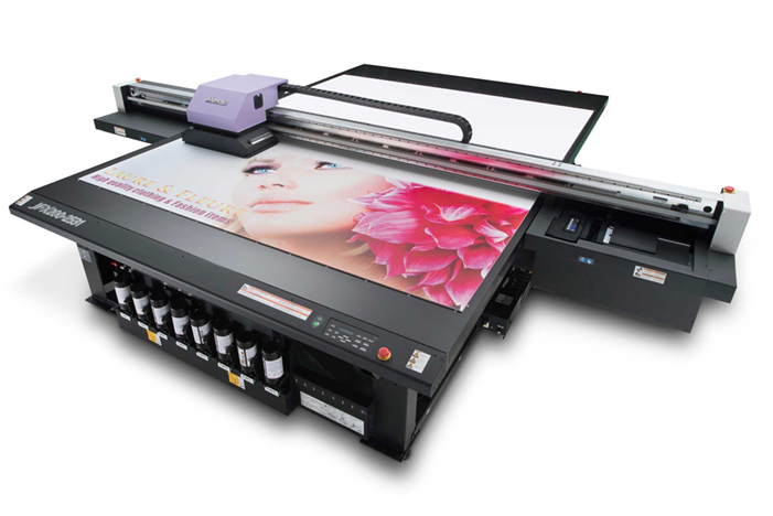
Most wide format printing engines have the potential to produce excellent output quality, both in terms of resolution and colour gamut. But to achieve the highest possible quality day in and day out, printing companies must make preparations before the device is installed to establish prime conditions for its performance.
All large format printing engines are checked by installation technicians to make sure that they are placed on a stable and even surface. However large format flatbed printers will especially benefit from a specially prepared and super-even, solid and extremely level floor. This is to ensure the exact placement of droplets on the substrate at speed, because any slight unevenness of the floor will be transmitted to the printhead when it travels quickly over the surface. If the droplets aren’t placed with micrometre precision, the image quality in terms of sharpness will be compromised. It’s a bit like trying to drive a car fast on an uneven surface, the vibrations will be most disturbing and impede overall performance. Digital printer manufacturers can advise on what they consider to be an ideal surface and how to prepare it prior to installation.
The three main external components which can have a negative effect on image quality are vibrations, and incorrect levels of heat and humidity in the ambient environment. So, in addition to optimising the floor conditions, any additional causes of vibration need to be addressed and the temperature and humidity kept stable over time in line with the manufacturer’s recommendations. As a rule of thumb a digital printer works best at the same temperature and humidity that we humans prefer, around 20° C and a humidity of about 50-60%. Temperature and humidity are, to some extent, interrelated, so try and keep at least one, and ideally both, of them stable. The humidity should be well over 30%, or both staff and printing devices will suffer. Staff will suffer from dried out air passages which can be unhealthy in the long term, and printing devices will show a tendency to produce banding if the humidity is too low. At low levels of humidity there is also the risk that the negative effects of antistatic will start to impact.
Optimise printer settings for the substrate
One of the advantages of digital wide format production is the versatility it offers with regard to the substrates that can be used. But this also poses a challenge, since every substrate needs customised and optimised output settings to ensure top quality, especially at speed. And if you use UV-curable inks you must make sure that the curing process is fully completed, or you will not only have problems with smearing ink, but the ink can be toxic when not fully cured. The amount of ink laid down on the substrate should also be optimised to guarantee the maximum possible colour gamut. On the other hand, you must avoid laying down too much ink, since this will cause all kinds of problems, not only longer drying or curing times, but might also create negative visual effects such as bronzing for example. Bronzing results from excess ink so that instead of, for example black, you get a “bronze” look in the deep shadows, where pigments in the ink create a top layer that looks like bronze when drying slowly and/or incompletely. Once all the factors that make up a proper calibration of the printer, based on specific combination of ink and substrate, the data should be saved for future use in a colour library. This library, built up over time, should contain all the necessary metadata needed to repeat specific types of jobs and to achieve exactly the same result again and again. This is sometimes called a Colour Profile, but it is more than the actual ICC profile for a given substrate. An ICC profile is a data set that characterises colour input and output devices, or colour spaces. The Colour Profile in a production system context encompasses all the parameters needed to produce an optimised and repeatable printed result, including information about what test form should be used when calibrating, using a particular substrate in a particular printer. Updating and finetuning these Colour Profiles is a never-ending process, but key if you want consistent top quality prints from all of your devices and for all types of substrates.
When installing a digital large format flatbed printer, like for example this Mimaki JFX200-2531, you need to make sure the floor is totally flat and even, and that you can keep both temperature and humidity at optimum levels.
The human factor
It’s all well and good to say that for every substrate and printer there should be a specific setting available somewhere in the system to be reused when needed. But the reality is that at most printing sites there is a range of digital printers of different ages and makes, and they are often delivered with their own type and model of print server, or Raster Image Processor (RIP). So from the operator’s point of view the challenge is that every RIP has its own user interface, similar perhaps to another, but still different. This can unfortunately increase the risk of operator errors, and so will add costs to the business because it demands more training and maintenance than if one single workflow system or RIP system, is used for all the digital printing devices on site. This might not be achieved immediately, but should be a goal to achieve over time. Using a single workflow system for all the devices makes both training and operations more efficient, and reduces the risk of mistakes and human errors. It also helps when establishing a central library of Colour Profiles, and so will help enhance the overall quality as well as help increase productivity and efficiency.
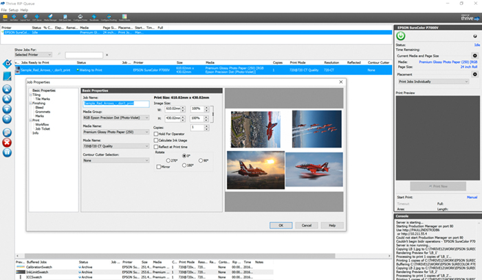
To avoid operator errors and reduce the time used on training and maintenance, you should strive to use one single workflow system for all devices, like for example ONYX Thrive shown here, instead of a different RIP for every single device.
Read up on new technology
There are few other sectors within the graphic arts that evolve as fast as the digital wide format printing sector. This means that there is constantly new technology on offer, both in terms of printing devices, inks and substrates. To have the best technology available for the job at hand, and to be able to offer the highest quality possible for your customers, at speed and efficiently, you need to keep a close eye on the continuous developments of printing technologies. So, stay informed, visit trade shows, read the trade press and test reports, since this is also part of striving to maintain and increase print quality.
Paul Lindström
The Wild Format guides are intended to expand awareness and understanding of the craziness that can be created on wide format digital printing devices, from floors to lampshades and everything in between.
These guides are made possible by a group of manufacturers working together with Digital Dots.
This article is supported by Efi (www.efi.com), Esko (www.esko.com) and HP (www.hp.com).
Together we hope you enjoy the articles and that you put into practise what you learn. If you want to talk about it, go to our LinkedIn group via this link.
Enjoy and Go Wild!
Lees verder....
Most wide format printing engines have the potential to produce excellent output quality, both in terms of resolution and colour gamut. But to achieve the highest possible quality day in and day out, printing companies must make preparations before the device is installed to establish prime conditions for its performance.
All large format printing engines are checked by installation technicians to make sure that they are placed on a stable and even surface. However large format flatbed printers will especially benefit from a specially prepared and super-even, solid and extremely level floor. This is to ensure the exact placement of droplets on the substrate at speed, because any slight unevenness of the floor will be transmitted to the printhead when it travels quickly over the surface. If the droplets aren’t placed with micrometre precision, the image quality in terms of sharpness will be compromised. It’s a bit like trying to drive a car fast on an uneven surface, the vibrations will be most disturbing and impede overall performance. Digital printer manufacturers can advise on what they consider to be an ideal surface and how to prepare it prior to installation.
The three main external components which can have a negative effect on image quality are vibrations, and incorrect levels of heat and humidity in the ambient environment. So, in addition to optimising the floor conditions, any additional causes of vibration need to be addressed and the temperature and humidity kept stable over time in line with the manufacturer’s recommendations. As a rule of thumb a digital printer works best at the same temperature and humidity that we humans prefer, around 20° C and a humidity of about 50-60%. Temperature and humidity are, to some extent, interrelated, so try and keep at least one, and ideally both, of them stable. The humidity should be well over 30%, or both staff and printing devices will suffer. Staff will suffer from dried out air passages which can be unhealthy in the long term, and printing devices will show a tendency to produce banding if the humidity is too low. At low levels of humidity there is also the risk that the negative effects of antistatic will start to impact.
Optimise printer settings for the substrate
One of the advantages of digital wide format production is the versatility it offers with regard to the substrates that can be used. But this also poses a challenge, since every substrate needs customised and optimised output settings to ensure top quality, especially at speed. And if you use UV-curable inks you must make sure that the curing process is fully completed, or you will not only have problems with smearing ink, but the ink can be toxic when not fully cured. The amount of ink laid down on the substrate should also be optimised to guarantee the maximum possible colour gamut. On the other hand, you must avoid laying down too much ink, since this will cause all kinds of problems, not only longer drying or curing times, but might also create negative visual effects such as bronzing for example. Bronzing results from excess ink so that instead of, for example black, you get a “bronze” look in the deep shadows, where pigments in the ink create a top layer that looks like bronze when drying slowly and/or incompletely. Once all the factors that make up a proper calibration of the printer, based on specific combination of ink and substrate, the data should be saved for future use in a colour library. This library, built up over time, should contain all the necessary metadata needed to repeat specific types of jobs and to achieve exactly the same result again and again. This is sometimes called a Colour Profile, but it is more than the actual ICC profile for a given substrate. An ICC profile is a data set that characterises colour input and output devices, or colour spaces. The Colour Profile in a production system context encompasses all the parameters needed to produce an optimised and repeatable printed result, including information about what test form should be used when calibrating, using a particular substrate in a particular printer. Updating and finetuning these Colour Profiles is a never-ending process, but key if you want consistent top quality prints from all of your devices and for all types of substrates.
When installing a digital large format flatbed printer, like for example this Mimaki JFX200-2531, you need to make sure the floor is totally flat and even, and that you can keep both temperature and humidity at optimum levels.
The human factor
It’s all well and good to say that for every substrate and printer there should be a specific setting available somewhere in the system to be reused when needed. But the reality is that at most printing sites there is a range of digital printers of different ages and makes, and they are often delivered with their own type and model of print server, or Raster Image Processor (RIP). So from the operator’s point of view the challenge is that every RIP has its own user interface, similar perhaps to another, but still different. This can unfortunately increase the risk of operator errors, and so will add costs to the business because it demands more training and maintenance than if one single workflow system or RIP system, is used for all the digital printing devices on site. This might not be achieved immediately, but should be a goal to achieve over time. Using a single workflow system for all the devices makes both training and operations more efficient, and reduces the risk of mistakes and human errors. It also helps when establishing a central library of Colour Profiles, and so will help enhance the overall quality as well as help increase productivity and efficiency.
To avoid operator errors and reduce the time used on training and maintenance, you should strive to use one single workflow system for all devices, like for example ONYX Thrive shown here, instead of a different RIP for every single device.
Read up on new technology
There are few other sectors within the graphic arts that evolve as fast as the digital wide format printing sector. This means that there is constantly new technology on offer, both in terms of printing devices, inks and substrates. To have the best technology available for the job at hand, and to be able to offer the highest quality possible for your customers, at speed and efficiently, you need to keep a close eye on the continuous developments of printing technologies. So, stay informed, visit trade shows, read the trade press and test reports, since this is also part of striving to maintain and increase print quality.
Paul Lindström
The Wild Format guides are intended to expand awareness and understanding of the craziness that can be created on wide format digital printing devices, from floors to lampshades and everything in between.
These guides are made possible by a group of manufacturers working together with Digital Dots.
This article is supported by Efi (www.efi.com), Esko (www.esko.com) and HP (www.hp.com).
Together we hope you enjoy the articles and that you put into practise what you learn. If you want to talk about it, go to our LinkedIn group via this link.
Enjoy and Go Wild!
Lees verder....Have you ever heard that print is dead? Well, if you have, I’m sure you disagree, especially when we look at the development of digitally printed options. So, the industry is far from dead, but rather brimming over with exciting new solutions and opportunities.

The appearance of colours very much depends on the light source, so if you want high colour accuracy you should adapt the reproduction of the images to the actual light of the viewing area.
But with such a wide array of applications offered especially in the wide format area, it’s quite a challenge to properly plan for a successful campaign. Your preparations should include the actual installation and use of the print, to ensure the optimal usage. For some applications like self-adhesive materials on windows you might not even have the skills or knowledge to apply the material in a way that looks nice, or have the time or knowledge to take them down again in a fast and efficient way. In this case it’s likely that the best option is to ask the supplier to include both the on-site installation and the removal, as being part of the total price of the print project.
The light matters
When planning for prints that are to be viewed indoors, and if colour accuracy matters to you, you need to be aware that the perceived colour in the images, including logos, very much depends on the light source that is used. While the graphic arts industry has agreed to evaluate prints and proofs at a standardised light condition called D50 (a simulation of Daylight at a whitepoint of 5000 Kelvin), this is not necessarily what will be in the area where your posters or indoor signage are supposed to go. In fact – it’s very unlikely that you will find such special light tubes used anywhere other than in a dedicated viewing booth.

You can create customised or personalised labels like this limited edition Absolut when using digital printers. Just make sure you adhere to rules and regulations for food and beverage when you do!
So why bother with using a standardised light like D50 at all? The reason is that if we didn’t, prints and proofs would look very different for everyone accessing if they match the colours we expect to achieve in prints. The D50 standard doesn’t only define the white point of the light, it also defines the spectral distribution of the light. It tries to create a pre-defined environment so that what the press operator looks at by the press or digital printer is very, very similar to what the print buyer, designer or photographer looks at when evaluating the contract proofs. So, if all parties use D50 when evaluating proofs and prints, we have common ground if we feel that colour needs to be adjusted. On top of this you should assess the prints in the final ambient light, and check if the appearance still is to your satisfaction. A colour-savvy prepress department can adjust the viewing conditions for a specified ambient light, and so better match the colour separations according to this.
Wrap it up!
A popular application is customised print using shrink wrap materials, for example on vehicles. If you are creative you can shrink wrap many other objects and so customize them to fit into your print project and campaign. But make sure the print firm has plenty of experience with this, because not all types of substrates stretch as much or as well as others, and not all types of substrates are suitable to use, for example together with food or drinks. There are lots of rules and regulations applying to print used with food and drinks, so even if you are excited about a brilliant idea for, let’s say, a custom-made coffee cup, don’t think that you are exempted from applicable laws and rules just because you aren’t a typical vendor of beverages or similar. Once you distribute an item which is likely to touch food or drinks you need to comply to the laws and regulations like everyone else in the industry.
Other applications where you should be careful to check what rules apply, is if it’s likely that the printed matter will reach children. There is legislation and certification related to health and safety as well as environmental impact. The Greenguard certification confirms that ink from vendors such as Efi, HP and Mimaki are safe. These certificates confirm that the inks are suitable for use in environments such as schools and healthcare facilities. So be on the lookout for vendors of inks and substrates who focus on sustainability, and favour them in your choices of materials for your projects.
Transport and distribution
Wide format print projects typically involve large printed objects and, if you don’t consider the choice of substrate, the cost of transport and distribution can run away with you. Banners, for example, have traditionally been printed on thick vinyl, sometimes for durability (vinyl can withstand both rain and sunlight if printed with suitable inks). But there are several alternative substrates that have similar properties to vinyl in regard to durability, for example canvas made of Polypropylene. A Polypropylene-based substrate can weigh 10% less than comparable thick vinyl alternatives, but in many cases work equally well. A substrate weighing so much less is not only cheaper to transport and distribute, it’s also much easier to handle for those installing the print. So, ergonomics should also be included when planning your print projects.
Increasingly professional print firms provide a distribution and rapid installation service which saves you and your staff time and effort. So, outsource when and wherever it makes sense, and you will save yourself time, stress and resources.
Paul Lindström
The Wild Format guides are intended to expand awareness and understanding of the craziness that can be created on wide format digital printing devices, from floors to lampshades and everything in between.
These guides are made possible by a group of manufacturers working together with Digital Dots.
This article is supported by Mimaki (www.mimakieurope.com) and Digital Dots (www.digitaldots.org).
Together we hope you enjoy the articles and that you put into practise what you learn. If you want to talk about it, go to our LinkedIn via this link.
Enjoy and Go Wild!
Lees verder....
Have you ever heard that print is dead? Well, if you have, I’m sure you disagree, especially when we look at the development of digitally printed options. So, the industry is far from dead, but rather brimming over with exciting new solutions and opportunities.
The appearance of colours very much depends on the light source, so if you want high colour accuracy you should adapt the reproduction of the images to the actual light of the viewing area.
But with such a wide array of applications offered especially in the wide format area, it’s quite a challenge to properly plan for a successful campaign. Your preparations should include the actual installation and use of the print, to ensure the optimal usage. For some applications like self-adhesive materials on windows, you might not even have the skills or knowledge to apply the material in a way that looks nice, or have the time or knowledge to take them down again in a fast and efficient way. In this case it’s likely that the best option is to ask the supplier to include both the on-site installation and the removal, as being part of the total price of the print project.
The light matters
When planning for prints that are to be viewed indoors, and if colour accuracy matters to you, you need to be aware that the perceived colour in the images, including logos, very much depends on the light source that is used. While the graphic arts industry has agreed to evaluate prints and proofs at a standardised light condition called D50 (a simulation of Daylight at a whitepoint of 5000 Kelvin), this is not necessarily what will be in the area where your posters or indoor signage are supposed to go. In fact – it’s very unlikely that you will find such special light tubes used anywhere other than in a dedicated viewing booth.
You can create customised or personalised labels like this limited edition Absolut when using digital printers. Just make sure you adhere to rules and regulations for food and beverage when you do!
So why bother with using a standardised light like D50 at all? The reason is that if we didn’t, prints and proofs would look very different for everyone accessing if they match the colours we expect to achieve in prints. The D50 standard doesn’t only define the white point of the light, it also defines the spectral distribution of the light. It tries to create a pre-defined environment, so that what the press operator looks at by the press or digital printer is very, very similar to what the print buyer, designer or photographer looks at when evaluating the contract proofs. So, if all parties use D50 when evaluating proofs and prints, we have common ground if we feel that colour needs to be adjusted. On top of this you should assess the prints in the final ambient light, and check if the appearance still is to your satisfaction. A colour-savvy prepress department can adjust the viewing conditions for a specified ambient light, and so better match the colour separations according to this.
Wrap it up!
A popular application is customised print using shrink wrap materials, for example on vehicles. If you are creative you can shrink wrap many other objects and so customize them to fit into your print project and campaign. But make sure the print firm has plenty of experience with this, because not all types of substrates stretch as much or as well as others, and not all types of substrates are suitable to use, for example together with food or drinks. There are lots of rules and regulations applying to print used with food and drinks, so even if you are excited about a brilliant idea for, let’s say, a custom-made coffee cup, don’t think that you are exempted from applicable laws and rules just because you aren’t a typical vendor of beverages or similar. Once you distribute an item which is likely to touch food or drinks you need to comply to the laws and regulations like everyone else in the industry.
Other applications where you should be careful to check what rules apply, is if it’s likely that the printed matter will reach children. There is legislation and certification related to health and safety as well as environmental impact. The Greenguard certification confirms that ink from vendors such as Efi, HP and Mimaki are safe. These certificates confirm that the inks are suitable for use in environments such as schools and healthcare facilities. So be on the lookout for vendors of inks and substrates who focus on sustainability, and favour them in your choices of materials for your projects.
Transport and distribution
Wide format print projects typically involve large printed objects and, if you don’t consider the choice of substrate, the cost of transport and distribution can run away with you. Banners, for example, have traditionally been printed on thick vinyl, sometimes for durability (vinyl can withstand both rain and sunlight if printed with suitable inks). But there are several alternative substrates that have similar properties to vinyl in regard to durability, for example canvas made of Polypropylene. A Polypropylene-based substrate can weigh 10% less than comparable thick vinyl alternatives, but in many cases work equally well. A substrate weighing so much less is not only cheaper to transport and distribute, it’s also much easier to handle for those installing the print. So, ergonomics should also be included when planning your print projects.
Increasingly professional print firms provide a distribution and rapid installation service which saves you and your staff time and effort. So, outsource when and wherever it makes sense, and you will save yourself time, stress and resources.
Paul Lindström
The Wild Format guides are intended to expand awareness and understanding of the craziness that can be created on wide format digital printing devices, from floors to lampshades and everything in between.
These guides are made possible by a group of manufacturers working together with Digital Dots.
This article is supported by Mimaki (www.mimakieurope.com) and Digital Dots (www.digitaldots.org).
Together we hope you enjoy the articles and that you put into practise what you learn. If you want to talk about it, go to our LinkedIn via this link.
Enjoy and Go Wild!
Lees verder....All digital printing technologies share the unique feature of being able to print very short runs, down to one copy. This opens up a lot of interesting applications, like personalised print and print on demand. While this is a well-known capability of high volume toner-based digital printing systems, using variable data printing on wide-format digital printers isn’t quite so well developed or widely used. Variable data printing means that each page or sheet of output can have different content – a component, such as an image, name and address, that varies. You can use this to create personalised versions of your project, or simply to change some or all the content with each print. If implemented properly, variable data printing can both save time and money as well as offer unique opportunities for wild format projects.
Every successful variable data print project starts with a properly managed and maintained database. A much-hyped phrase today is “Big Data”, which refers to exploiting all the data available for a given topic or activity. The data are generally managed via the internet, but you can also build your own database, rich with metadata about your customers, or potential customers. The trick with variable data printing is to find or build such a well-managed database. For example, if you want to reach young women aged 20-30 with sales promotions about your product, of course the database you might be interested in needs to contain metadata about individuals’ gender and age.
Filtering out what is of interest to you in your variable data project is called “data mining”, and how well this is done depends on the quality of the database and how up to date it is. But the effectiveness also depends on the quality of the search engine, and the algorithms used to select the interesting and valuable data from what is often a huge database. If you manage your own database, you need to constantly update it and keep it relevant so that when you want to create a wild format project for specific interests, you can find the data you want. Such straightforward housekeeping is unfortunately often neglected, which can mean that the potential of the database is never fully exploited or the variable data project results are disappointing.
Dos and Don’ts
When designing a variable data project you need to strike a balance between addressing the receiver of the printed product in a personal way, and respecting their integrity. While it’s tempting to use an intimate and friendly tone, some people will just be put off if you try and pretend to be a close friend, when you are addressing a stranger. This is particularly true if you have access to what can be seen as confidential or private information. Instead of striking a personal tone you might find that the receiver is put off by what comes across as an intrusion. So, while we normally will benefit from creating a personalised message, we shouldn’t push this too far.

Planning for a variable data print project is top heavy, so most of your variable data project time should be used in proper planning. The printing part should be quite easy, with the right tools in place.
Some techy stuff to consider
Technically we now need to couple the extracted data with the artwork created for the print project. For small and very simple projects you can get along with a data file created in Excel and imported to, for example, InDesign. But for more complex and larger projects you will need a dedicated solution for variable data production. There are many software tools on the market to help with this, for example SmartStream Designer from Hewlett-Packard, PrintShop Mail from Objectif Lune and PersonalEffect and uDirect from XMPie, just to mention a few, because there are hundreds.
Your next technicality is to link the artwork and the data with the printing system, specifically the Raster Image Processor (RIP) which drives the output device. This is sometimes called the Digital Front End (DFE), or the workflow system. The EFI Fiery RIP is one of the most popular and successful DFEs for digital devices and is compatible with many, many variable data solutions. Your print service provider will know what features and functions their workflow system (RIP) supports, and can advise on the best approach for a successful variable data printing project.
![]()
While a name badge perhaps isn’t thought of as a job for a very large format printer, it can be if we talk hundreds or even thousands of badges, each printed with variable data content.
Use case
So, what type of variable data applications using wide format printers are possible? Well, digital printing in general offers a huge plethora of opportunities and possibilities, and frankly the limiting factor is probably your imagination.
But let’s take a simple use case: name badges for an important conference you are planning. Name badges are normally printed one by one, often using analogue screen printing, or possibly a small digital printer dedicated to printing badges. But what if you have an idea of a snazzy badge in pink Plexiglas, in the shape of your company logo? This might be thought of as too ambitious and expensive a project, and written off as too wild an idea to pursue. But wait a minute! What if you treat it as a variable data project and use a flatbed large format printer? Now you can probably print all the badges on one sheet of coloured Plexiglas, positioned by the RIP system using the merged artwork and database info (let’s say the person’s name and company name and perhaps their title) and then cut to size using a laser cutting board. The final product is not a very large print, but the device that printed it certainly was. This is a very simple example, but it demonstrates what’s possible, once you have the tools and an idea of how to use them.
Business benefits
Whether you are a publisher, designer or print company owner, being aware of the opportunities and possible benefits of variable data printing means that you are ready and prepared when and if the opportune moment comes along. Needless to say, you will benefit both from unique, and what are perceived as “cool”, applications but also because applying variable data print technology can reduce cost and turnaround times in printing projects. These two aspects are surely of value. Go explore and go wild in some upcoming large format digital print project.
Paul Lindström
The Wild Format guides are intended to expand awareness and understanding of the craziness that can be created on wide format digital printing devices, from floors to lampshades and everything in between.
These guides are made possible by a group of manufacturers working together with Digital Dots.
This article is supported by Agfa (www.agfa.com), Mimaki (www.mimakieurope.com) and Digital Dots (www.digitaldots.org).
Together we hope you enjoy the articles and that you put into practise what you learn. If you want to talk about it, go to our LinkedIn group via this link.
Enjoy and Go Wild!
Lees verder....- 1
- 2
- Volgende »


![]()
Kandidaten gezocht


![]()
De trainingen voor 2022 staan gereed. Kijk voor het volledige online aanbod van bestaande- en nieuwe trainingen op de website.


BLOKBOEK.COM EN PRINTMEDIANIEUWS: HET OPTIMALE DOELGROEP BEREIK